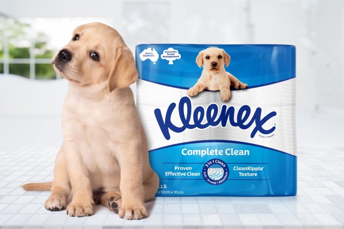
Kleenex has unveiled a refreshed packaging design for its range of toilet tissue products.
Kimberly-Clark, the parent company of Kleenex, engaged independent brand and design agency Hulsbosch to evolve the brand’s packaging by:
- Leveraging its existing assets, including the iconic puppy
- Strengthening Kleenex’s product proposition
- Modernise its visual identity
- Improve shelf presence
According to a statement, the refreshed design architecture introduces a clearer hierarchy, simplifying on-pack information to make navigation easier for consumers.
“By increasing the prominence of the puppy, a beloved and recognised brand cue, the new design ensures stronger shelf standout and aligns with Kleenex’s premium positioning,” says the statement.
Kleenex Brand Manager Leah King says the refreshed packaging reflects Kleenex’s commitment to keeping the brand relevant and consumer focused.
“Hulsbosch has delivered a design that strengthens our proposition, enhances brand recall, and supports our ongoing efforts to drive premiumisation in the category,” she says.
Hulsbosch Creative Director Mikey Hart says the agency’s approach focused on elevating Kleenex’s distinctive assets while improving shelf navigation and product differentiation.
“The packaging balances modern design principles with the strong emotional connection consumers have with the puppy, which remains central to the brand’s identity,” he says.
“By creating a clear and cohesive design architecture, we’ve helped ensure Kleenex continues to have a strong presence in the category.”


