


Packs that stand out on shelf in a sea of similar shapes and materials tend to be ‘different’ in some way. The pack might be visually a brighter colour, a different shape, an unusual size, or calls for consumer engagement.
By Australian Institute of Packaging Executive Director Nerida Kelton.
I often find myself stopping to take pause when a random pack catches my eye as I am wandering down a supermarket aisle.
One such pack that caught my eye was the Monday haircare range from New Zealand. What made this pack stand out was the neutral pink tone that they selected and the shape of the bottle. The pack made me feel like it was a premium range at a supermarket price. I must confess that I bought a set; even though I do not use that shampoo brand, all because I loved the packaging.
Other packs that have stood out to me lately are those that create consumer engagement and invite you to become a part of their story.
Looking at the broad range of finalists in the newly established Marketing Design of the Year category for the 2021 Australasian Packaging Innovation & Design (PIDA) Awards there are some innovative examples of how packaging can become one of the strongest and most important tools for marketing a product and the brand.
Packaging should be seen as an opportunity to create powerful and evoking messages with your consumers and to establish brand loyalty. This can incorporate the functionality of the pack, the aesthetic design and the outstanding visual appearance that makes the pack stand out on shelf, the premium and gifting style design, and/or unique and interactive communication tools on the pack.
Two unique and innovative examples within the Marketing category finalists are Cutri Fruit ‘Galaxy’ peaches and the KitKat ‘Recycle Me, Give the Planet A Break’ wrappers.
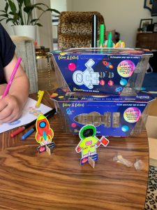
Cutri Fruit Galaxy Fruits ‘Saturn Peaches’ bring outer space to the aisles
When designing the Galaxy Fruits ‘Saturn Peaches’ packaging for Cutri Fruit, N.A.V.I Co Global ventured into new territory and created an intuitive and interactive consumer-facing brand. For over 40 years, Cutri has only supplied generic, unbranded produce to supermarkets and for the first time decided to formally introduce their own brand to consumers. Cutri wanted the packaging to provide a positive first impression that was unique and engaging for the customers, and also fit-for-purpose.
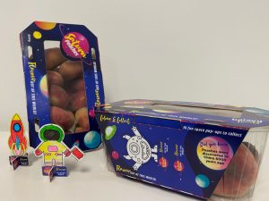
Cutri was looking for an out-of-this-world offering for their uniquely shaped peaches and wanted the packaging to create a point of difference on shelf.
The Galaxy Fruits ‘Saturn Peaches’ branding is family-friendly, using bright colours and eye-catching graphics, including interactive elements to build an emotional connection and ultimately pique interest and awareness of this new variety. Centred in the attention-grabbing design is a window to show off the unique flat, saturn-like peaches. The pack utilises interactive pop-outs to create collectibles and encourage repeat purchase. The window can be used as a projection screen and reused over and over by the children. Cutri wanted the interactive section to create activities for the children such as colouring in, to encourage creativity and mental stimulation.
The packaging created its own version of Augmented Reality with the mobile phone projector, bringing outer space into living rooms all over the country, and acting as a conduit for kids to learn about space, creativity and healthy eating.
Cutri incorporated a QR code on-pack for consumers to find out more about the Galaxy Fruits ‘Saturn Peaches’ and also used the packaging itself to include a variety of messages around the health benefits and origins.
KitKat ‘Recycle me, Give the Planet A Break’ wrappers shift the recycling message to the front of pack
According to a recent survey undertaken by Nestle Australia, 80% of Australians show a strong desire to recycle correctly, however almost 48% of the nation simply get it wrong and end up disposing of the packaging incorrectly.
 To encourage and educate Australians to ‘Give the Planet a Break’ by recycling their soft plastics correctly, KitKat has made the bold move to temporarily replace its logo on the iconic four-finger milk chocolate bar with a call out to recycle in store.
The limited-edition bars feature a KitKat-inspired recycling symbol and an explicit call to action for everyone to actively drop off wrappers at REDcycle collection bins, located in most major Australian supermarkets.
What makes this pack stands out is that the design of the KitKat wrapper artwork completely removes the KitKat branding on the front of pack and replaces it with a mobius loop, a symbol which consumers associate with recycling.
The use of the mobius loop symbol takes up the front of pack, is eye-catching and delivers the message clearly to consumers about the importance of packaging that is recyclable.
The mobius loop symbol is accompanied by the tagline ‘Recycle me, give the planet a break’, which is also a play on words on the ‘Have a break, have a KitKat’ tagline. This ties the Nestlé KitKat brand with their sustainability message and has a long-lasting impact on the consumer.
The front of pack design also includes an arrow pointing towards a bin which has the message ‘In-store drop off’ which informs and educates the consumers on the method of recycling soft plastics. The ‘Store drop off’ statement links to the Australasian Recycling Logo (ARL) instruction of going into a REDcycle participating retailers and dropping off soft plastic packaging in the collection bins.
On the shelf, the combinations of these front of pack designs can incite a sustainability message that consumers can quickly associate with, while at the same time giving informative messaging on recycling.
In the past, packaging sustainability messaging has typically been placed on the side or back of pack. The previous packaging artwork focused on the product or brand itself, and not on the recyclability of the packaging.
This new KitKat design enables packaging sustainability to be the primary element of the packaging artwork, without taking away the consumer’s ability to recognise the product. The core design elements of the KitKat brand – the KitKat red colour, the iconic shape, and the white oval background is still maintained. Consumers are therefore able to quickly associate the product with the same KitKat they love. In addition, the mobius loop symbol is made using KitKat fingers and further associates the product with the brand.
Next time you are wandering down the aisles keep an eye out for packs that stand out on shelf and invoke consumer engagement.
About Nerida Kelton MAIP
Nerida has worked in the packaging industry for more than 23 years and is the Executive Director for the Australian Institute of Packaging, which is the peak professional body for packaging training and education in Australasia. Nerida is passionate about sustainable and circular packaging design and the ‘Save food packaging design’ movement and is the lead for the Save Food Packaging Consortium project within the Fight Food Waste Cooperative Research Centre and was the packaging representative on the Department of Agriculture, Water and the Environment’s National Food Waste Strategy Steering Committee. She invests her time educating the industry on the important role that packaging plays in minimising food waste and how designing ‘save food packaging’ can make a difference.
![]() About Australian Institute of Packaging
About Australian Institute of Packaging
The Australian Institute of Packaging (AIP) is the peak professional body for packaging education and training in Australasia, helping to shape the careers of generations of packaging professionals, from packaging technologists to international packaging business leaders, along with a host of people in associated disciplines, such as sales and marketing, purchasing, production and environment.
The AIP was founded in 1963 in response to a need for packaging technologists to interact and provide a professional identity for individuals within the packaging industry. Having served the industry for more than 55 years, the AIP is the only professional body designed to provide professional and personal development to all levels of the packaging industry.