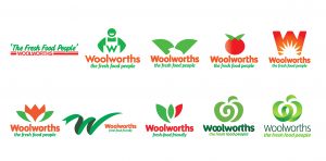
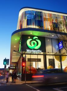
Woolworths redesigned its logo for the first time in more than 20 years in October 2008.
This redesign, which celebrates 10 years this October, represented the biggest change in the communication of the business.
Woolworths Supermarkets says it wanted a modern identity that not only reflected its positioning as “the fresh food people”, but also helped forge its new direction to make grocery shopping an easy experience in a contemporary environment.
The ‘organic’ W
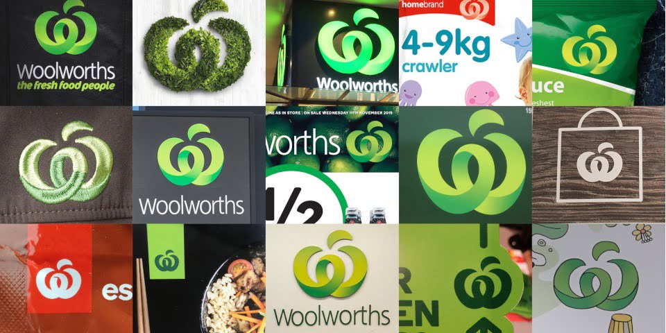
Brand agency Hulsbosch developed the organic-shaped ‘W’.
The concept was to represent fresh food, energy, nature and a commitment to the Woolworths heritage. The project involved the design of the identity and the installation of the signage in all stores. The agency also designed the retail-advertising format, in-store graphics and the complete range of private-label packaging.
The entire rebranding project took five years.
According to Hulsbosch, industry commentators recognise the Woolworths rebrand as one of the most successful in Australian history. Sales jumped by 6.5 per cent to more than $12 billion in the quarter ended March 2009, driven by groceries and liquor. A variety of national and international brand-ranking awards also named Woolworths ‘most valuable brand’.
‘Brand is everything’
Today, the brand comes into contact with, on average, an influential audience of more than three million customers a day.
Woolworths says its logo achieves one of the highest grades for unprompted consumer recall and understanding in Australia. The supermarket also says it scores highly among top industry markers for ‘voice of customer’, ‘voice of team’ and ‘voice of supplier’.
“Brand is everything for a consumer-facing business-like Woolworths Supermarkets,” Woolworths CEO Brad Banducci said.
“We’ve been blessed with such a beautiful, green, produce-driven brand, because it captures who we are when we’re at our best.”


