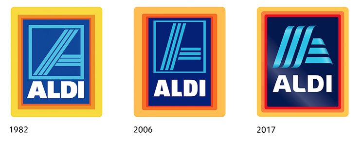
 ALDI Australia’s logo will be updated with a fresh new look later this year, as part of an international initiative from the ALDI South Group for all countries.
The new logo has been designed to reflect the contemporary image of ALDI and key developments it has recently undertaken. In Australia, this includes ALDI’s commitment to rolling out its new store format across all stores by 2020.
“For more than 50 years internationally and 16 in Australia, ALDI has been focused on a simple concept: high-quality products at the best possible price,” an ALDI Australia spokesperson said.
“The principle of simplicity is reflected in the new logo. Despite an updated appearance, it still contains the typical ALDI colours. Even the familiar ‘A’ symbol in light blue still forms part of the new logo, but now also functions as a modern independent design element.”
This is not the first time the appearance of the logo has been updated. ALDI’s first logo was created at the end of the 1940s by the Albrecht brothers for their grocery stores. Then, the logo included a red background and the store name ‘Karl Albrecht Lebensmittel’ in white lettering.
Following the transition to discount retail, a new logo design was introduced in 1963 that comprised the word ‘Albrecht’ in white letters on a blue background with a narrow white border. This version of the logo was then slightly modified for use in Austria and the US.
The original version of today’s logo was developed in 1982. This version included the cropped ‘A’ symbol on a blue background with a tricoloured border. In the years 2001 and 2006, several slight adjustments were also made to the logo’s colours.


