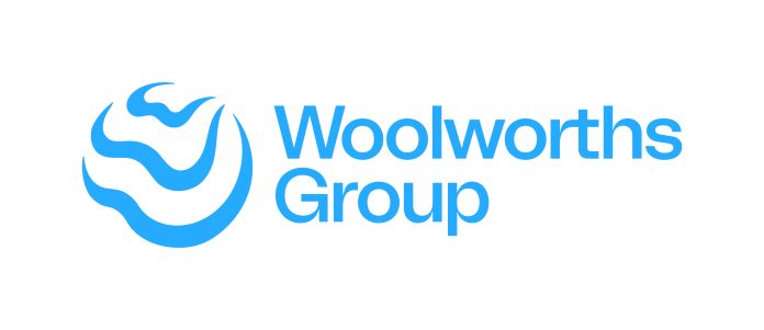
Woolworths Group is rolling out a new brand identity which it hopes better symbolises the company’s evolution and what its collective businesses and platforms stand for today.
According to Woolworths, the new symbol showcases the impact the company can have when it comes together in partnership with others to create change for a better tomorrow.
“The world is constantly changing and evolving, and we need to do likewise,” says Woolworths Group CEO Brad Banducci.
“The last two years have been a period of immense change. As a team we’ve not only had to navigate a pandemic, but we’ve also made significant changes to the shape of our Group and the businesses and platforms within it.
“It’s been an era of care for people, as well as partnership, innovation, inclusion and sustainability and being connected by a shared purpose has never been more important.
“It is the power of ‘We’ in terms of creating better experiences together for a better tomorrow that is represented in our new Group brand identity. It’s a symbol of the positive impact that we aspire to have and the purpose that unites us.
“It’s only by working together as a Group, across all our businesses and platforms, and in partnership with others, that we will be able to help to create a better tomorrow.”
Behind the new symbol
The new brand symbol and system was developed in partnership with Re, part of the M&C Saatchi Group.
“In designing the new symbol, it was important we represented what we stand for as a Group today and how we will continue to act in the future. Our commitment to our purpose was key to the design architecture,” says Woolworths Group Chief Marketing Officer Andrew Hick.
“It all starts with ‘We’, with the multiple W’s embodying how together as Woolworths Group we can create positive impact.
“The shape is fluid to capture the spirit of agility and adaptability whilst deliberately being an open shape to signal an expansive mindset welcoming partnership.
“With a living blue colour scheme, our collective impact is also symbolised by the waves and ripples, converging on a common point on the horizon as a reminder of our shared commitment as a Group to a better tomorrow.”
Mr Hicks adds: “The new symbol is only the start of how we are evolving the ways in which we communicate our Group’s collective impact to our key stakeholders, suppliers, partners, customers and our team.
“We’re excited by the opportunity it creates to further unite us across the various Group businesses and with our partners.”


